Study: Americans using less health care, but paying more for it

Study: Americans using less health care, but paying more for it

Study: Americans using less health care, but paying more for it


Health-care spending has increased because prices are rising, not because Americans are using more health care, according to a new study released Tuesday.

The report from the Health Care Cost Institute (HCCI) showed that total health-care spending grew by 4.6 percent per person from 2015 to 2016 even as utilization of services remained steady, or declined in some cases.

As a result, health-care spending per person reached a new high of $5,407 in 2016.

“It is time to have a national conversation on the role of price increases in the growth of health care spending,” said Niall Brennan, president of the HCCI.

“Despite the progress made in recent years on value-based care, the reality is that working Americans are using less care but paying more for it every year. Rising prices, especially for prescription drugs, surgery, and emergency department visits, have been primary drivers of faster growth in recent years.”

The study focused on people under the age of 65 with employer-sponsored health insurance.

Spending on brand named prescription drugs grew by 110 percent between 2012 and 2016, but utilization dropped 38 percent.

According to the report, the average price for an emergency room visit went up 31.5 percent between 2012 and 2016, but the number of visits only increased slightly.

The average price for surgical admissions increased by 30 percent between that five-year period, but there was a 16 percent drop in utilization.


Why the U.S. Spends So Much More Than Other Nations on Health Care

Why the U.S. Spends So Much More Than Other Nations on Health Care

Image result for us healthcare money

The United States spends almost twice as much on health care, as a percentage of its economy, as other advanced industrialized countries — totaling $3.3 trillion, or 17.9 percent of gross domestic product in 2016.

But a few decades ago American health care spending was much closer to that of peer nations.

What happened?

A large part of the answer can be found in the title of a 2003 paper in Health Affairs by the Princeton University health economist Uwe Reinhardt: “It’s the prices, stupid.

The study, also written by Gerard Anderson, Peter Hussey and Varduhi Petrosyan, found that people in the United States typically use about the same amount of health care as people in other wealthy countries do, but pay a lot more for it.

Ashish Jha, a physician with the Harvard T.H. Chan School of Public Health and the director of the Harvard Global Health Institute, studies how health systems from various countries compare in terms of prices and health care use. “What was true in 2003 remains so today,” he said. “The U.S. just isn’t that different from other developed countries in how much health care we use. It is very different in how much we pay for it.”

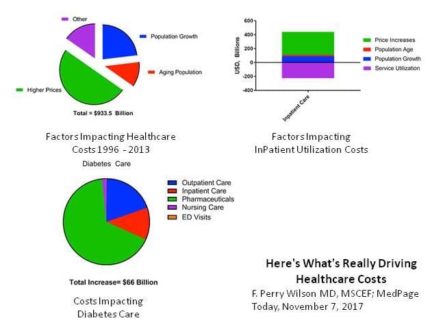
A recent study in JAMA by scholars from the Institute for Health Metrics and Evaluation in Seattle and the U.C.L.A. David Geffen School of Medicine also points to prices as a likely culprit. Their study spanned 1996 to 2013 and analyzed U.S. personal health spending by the size of the population; its age; and the amount of disease present in it.

They also examined how much health care we use in terms of such things as doctor visits, days in the hospital and prescriptions. They looked at what happens during those visits and hospital stays (called care intensity), combined with the price of that care.

The researchers looked at the breakdown for 155 different health conditions separately. Since their data included only personal health care spending, it did not account for spending in the health sector not directly attributed to care of patients, like hospital construction and administrative costs connected to running Medicaid and Medicaid.

Over all, the researchers found that American personal health spending grew by about $930 billion between 1996 and 2013, from $1.2 trillion to $2.1 trillion (amounts adjusted for inflation). This was a huge increase, far outpacing overall economic growth. The health sector grew at a 4 percent annual rate, while the overall economy grew at a 2.4 percent rate.

You’d expect some growth in health care spending over this span from the increase in population size and the aging of the population. But that explains less than half of the spending growth. After accounting for those kinds of demographic factors, which we can do very little about, health spending still grew by about $574 billion from 1996 to 2013.

Did the increasing sickness in the American population explain much of the rest of the growth in spending? Nope. Measured by how much we spend, we’ve actually gotten a bit healthier. Change in health status was associated with a decrease in health spending — 2.4 percent — not an increase. A great deal of this decrease can be attributed to factors related to cardiovascular diseases, which were associated with about a 20 percent reduction in spending.

This could be a result of greater use of statins for cholesterol or reduced smoking rates, though the study didn’t point to specific causes. On the other hand, increases in diabetes and low back and neck pain were associated with spending growth, but not enough to offset the decrease from cardiovascular and other diseases.

Did we spend more time in the hospital? No, though we did have more doctor visits and used more prescription drugs. These tend to be less costly than hospital stays, so, on balance, changes in health care use were associated with a minor reduction (2.5 percent) in health care spending.

That leaves what happens during health care visits and hospital stays (care intensity) and the price of those services and procedures.

Did we do more for patients in each health visit or inpatient stay? Did we charge more? The JAMA study found that, together, these accounted for 63 percent of the increase in spending from 1996 to 2013. In other words, most of the explanation for American health spending growth — and why it has pulled away from health spending in other countries — is that more is done for patients during hospital stays and doctor visits, they’re charged more per service, or both.

Though the JAMA study could not separate care intensity and price, other research blames prices more. For example, one study found that the spending growth for treating patients between 2003 and 2007 is almost entirely because of a growth in prices, with little contribution from growth in the quantity of treatment services provided. Another study found that U.S. hospital prices are 60 percent higher than those in Europe. Other studiesalso point to prices as a major factor in American health care spending growth.

There are ways to combat high health care prices. One is an all-payer system, like that seen in Maryland. This regulates prices so that all insurers and public programs pay the same amount. A single-payer system could also regulate prices. If attempted nationally, or even in a state, either of these would be met with resistance from all those who directly benefit from high prices, including physicians, hospitals, pharmaceutical companies — and pretty much every other provider of health care in the United States.

Higher prices aren’t all bad for consumers. They probably lead to some increased innovation, which confers benefits to patients globally. Though it’s reasonable to push back on high health care prices, there may be a limit to how far we should.


Here’s What’s Really Driving Healthcare Costs

https://www.medpagetoday.com/publichealthpolicy/healthpolicy/69102?pop=0&ba=1&xid=fb-md-pcp

Image result for Here's What's Really Driving Healthcare Costs


The market economy fails when applied to healthcare.

That healthcare expenditures in the US are high and rising rapidly is nothing new, but this study appearing in the Journal of the American Medical Association identifies the exact components of healthcare that are driving those soaring costs. As F. Perry Wilson, MD points out in this 150 Second Analysis, the data suggest traditional economic forces break down in the US healthcare market.

Transcript:

It’s no secret that healthcare costs in the United States are exceedingly high, and rising.

The US spends the most of any country in the world on healthcare in terms of percent of GDP, sitting around 18% as of the most recent data.

But to address the issue, we need to understand what is driving this increase, and a new study appearing in the Journal of the American Medical Association does the best job yet in decomposing the factors behind the rising costs.

The researchers used data from the US Disease Expenditure Project, which utilizes 183 data sources and 2.9 billion patient records to quantify where each healthcare dollar is being spent in this country.

Here’s the top level overview. After accounting for inflation, healthcare expenditures increased by $933.5 billion between 1996 and 2013. To put that into perspective, that’s enough money to create 9 additional interstate highway systems. We could fully fund 3 NASAs every year.

Or we could provide 400 malaria nets to every man, woman, and child in Africa. We could even do something crazy like pay down the debt.

But to save money in the future, we have to know why we keep spending more. Here’s the breakdown.

Some of the increase in spending comes from the aging of the US population and population growth. Not much we can do about that. But 50% of the increase was simply due to higher prices.

This is distinct from healthcare utilization. In fact, healthcare utilization was decreased a bit over this time period. This is shown most dramatically in the data for inpatient care. Take a look at this bar chart.

Use of inpatient care (that’s service utilization – in purple) went down substantially from 1996 – 2013 as we moved to more outpatient treatment. But this may have been a Faustian bargain. The price of the inpatient care that remained went up much more – increasing overall inpatient spending by around 250 billion dollars.

Let’s take a moment to realize how weird this is, economically. Demand for healthcare decreased over time. Prices increased. That is not an efficient market.

Different chronic diseases had different patterns of price increases. The biggest increase was seen in diabetes care, as you can see here, driven largely by rising costs of pharmaceuticals.

Regardless of the disease, though, it is clear that it is the price of what we’re buying – whether a drug, an ED visit, or a hospital stay – not the amount of what we’re buying that is the major driver of cost increases. Efforts to reduce the consumption of healthcare, therefore, may not bend the cost curve as much as efforts to reduce its price. That’s just my 2 cents.

Health Sector Trend Report, January 2017

Click to access Altarum%20RWJF%20Trend%20Report%20January%202017.pdf

Image result for Altarum Institute

These reports, with funding from the Robert Wood Johnson Foundation, provide a monthly summary of key trends in health care spending, prices, utilization, and employment.

They are related to, but distinct from, the Center for Sustainable Health Spending Health Sector Economic Indicators.

The trend reports make direct use of the Quarterly Services Survey (QSS), the timeliest source of detailed, survey-based spending information for health care services, which account for more than 70% of national health spending.

Each quarter, when new QSS data are released (March, June, September, and December), we will publish an expanded version of this report with a more detailed analysis of health care services trends.

The regular monthly reports will supplement the most recent full quarterly analysis with new data on other aspects of health spending, health care prices and utilization, employment and early indications of the trends for the next quarter.

This report provides a monthly summary of key trends in U.S. health care spending, prices, utilization, and employment. The reports build on Altarum’s Health Sector Economic Indicators SM briefs (HSEI) and make direct use of the U.S. Census Bureau’s Quarterly Services Survey (QSS). When new QSS data are released (March, June, September, December), an expanded version of this report is published. Interim reports highlight noteworthy health sector trends and early indications of results for the next quarter. In this January 2017 report, spending estimates are available through November 2016, while prices and labor are available through December 2016.