

Cartoon – Actual Results Indicate
http://www.reason.com/2021/06/22/

An argument for humility in the face of pandemic forecasting unknown unknowns.
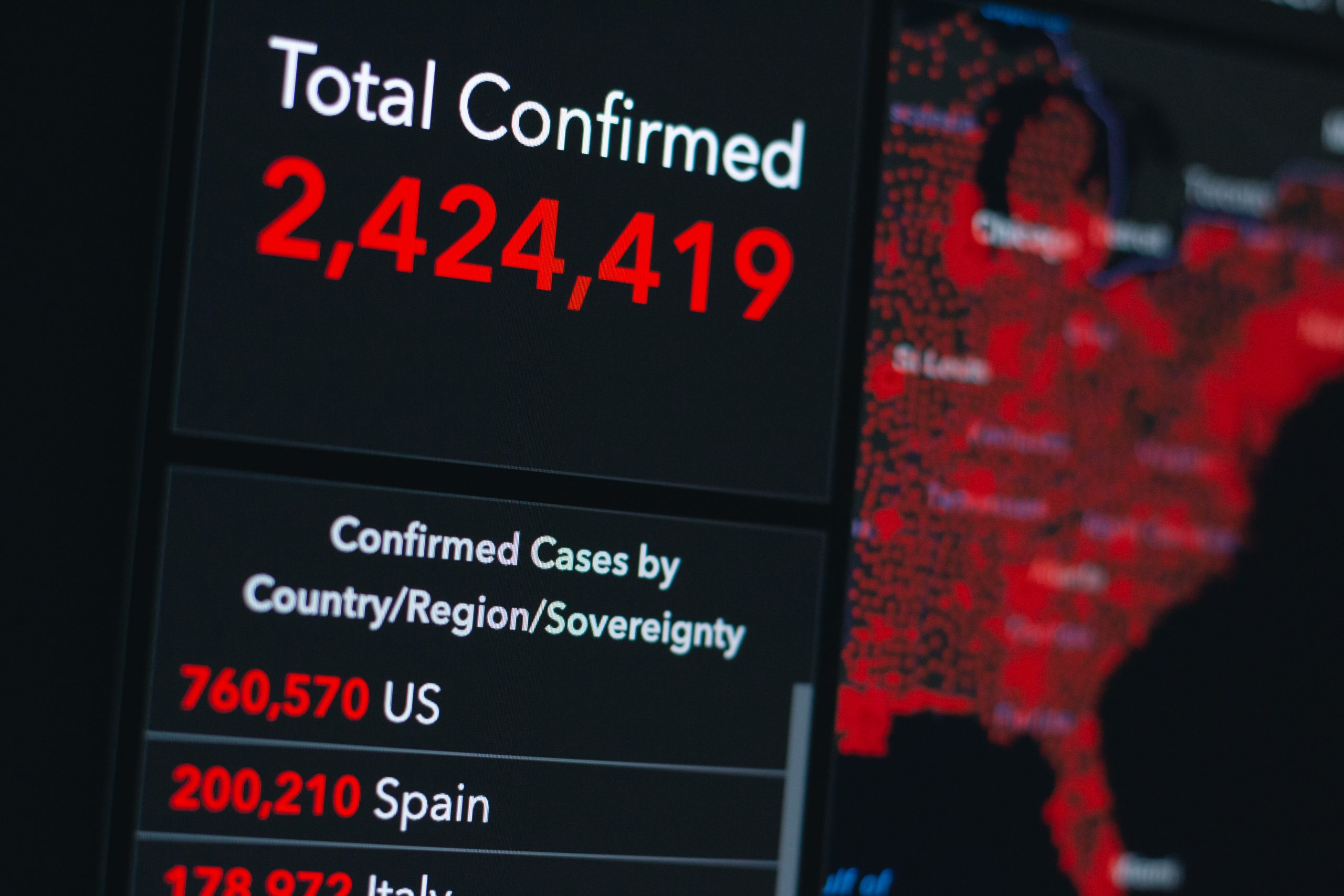
“Are we battling an unprecedented pandemic or panicking at a computer generated mirage?” I asked at the beginning of the COVID-19 pandemic on March 18, 2020. Back then the Imperial College London epidemiological model’s baseline scenario projected that with no changes in individual behaviors and no public health interventions, more than 80 percent of Americans would eventually be infected with novel coronavirus and about 2.2 million would die of the disease. This implies that 0.8 percent of those infected would die of the disease. This is about 8-times worse than the mortality rate from seasonal flu outbreaks.
Spooked by these dire projections, President Donald Trump issued on March 16 his Coronavirus Guidelines for America that urged Americans to “listen to and follow the directions of STATE AND LOCAL AUTHORITIES.” Among other things, Trump’s guidelines pressed people to “work or engage in schooling FROM HOME whenever possible” and “AVOID SOCIAL GATHERINGS in groups of more than 10 people.” The guidelines exhorted Americans to “AVOID DISCRETIONARY TRAVEL, shopping trips and social visits,” and that “in states with evidence of community transmission, bars, restaurants, food courts, gyms, and other indoor and outdoor venues where people congregate should be closed.”
Let’s take a moment to recognize just how blindly through the early stages of the pandemic we—definitely including our public health officials—were all flying at the time. The guidelines advised people to frequently wash their hands, disinfect surfaces, and avoid touching their faces. Basically, these were the sort of precautions typically recommended for influenza outbreaks. On July 9, 2020, an open letter from 239 researchers begged the World Health Organization and other public health authorities to recognize that COVID-19 was chiefly spread by airborne transmission rather than via droplets deposited on surfaces. The U.S. Centers for Disease Control and Prevention (CDC) didn’t update its guidance on COVID-19 airborne transmission until May 2021. And it turns out that touching surfaces is not a major mode of transmission for COVID-19.
The president’s guidelines also advised, “IF YOU FEEL SICK, stay home. Do not go to work.” This sensible advice, however, missed the fact that a huge proportion of COVID-19 viral transmission occurred from people without symptoms. That is, people who feel fine can still be infected and, unsuspectingly, pass along their virus to others. For example, one January 2021 study estimated that “59% of all transmission came from asymptomatic transmission, comprising 35% from presymptomatic individuals and 24% from individuals who never develop symptoms.”
The Imperial College London’s alarming projections did not go uncontested. A group of researchers led by Stanford University medical professor Jay Bhattacharya believed that COVID-19 infections were much more widespread than the reported cases indicated. If the Imperial College London’s hypothesis were true, Bhattacharya and his fellow researchers argued, that would mean that the mortality rate and projected deaths from the coronavirus would be much lower, making the pandemic much less menacing.
The researchers’ strategy was to blood test people in Santa Clara and Los Angeles Counties in California to see how many had already developed antibodies in response to coronavirus infections. Using those data, they then extrapolated what proportion of county residents had already been exposed to and recovered from the virus.
Bhattacharya and his colleagues preliminarily estimated that between 48,000 and 81,000 people had already been infected in Santa Clara County by early April, which would mean that COVID-19 infections were “50-85-fold more than the number of confirmed cases.” Based on these data the researchers calculated that toward the end of April “a hundred deaths out of 48,000-81,000 infections corresponds to an infection fatality rate of 0.12-0.2%.” As I optimistically reported at the time, that would imply that COVID-19’s lethality was not much different than for seasonal influenza.
Bhattacharya and his colleagues conducted a similar antibody survey in Los Angeles County. That study similarly asserted that COVID-19 infections were much more widespread than reported cases. The study estimated 2.8 to 5.6 percent of the residents of Los Angeles County had been infected by early April. That translates to approximately 221,000 to 442,000 adults in the county who have had the infection. “That estimate is 28 to 55 times higher than the 7,994 confirmed cases of COVID-19 reported to the county by the time of the study in early April,” noted the accompanying press release. “The number of COVID-related deaths in the county has now surpassed 600.” These estimates would imply a relatively low infection fatality rate of between 0.14 and 0.27 percent.
Unfortunately, from the vantage of 14 months, those hopeful results have not been borne out. Santa Clara County public health officials report that there have been 119,712 diagnosed cases of COVID-19 so far. If infections were really being underreported by 50-fold, that would suggest that roughly 6 million Santa Clara residents would by now have been infected by the coronavirus. The population of the county is just under 2 million. Alternatively, extrapolating a 50-fold undercount would imply that when 40,000 diagnosed cases were reported on July 11, 2020, all 2 million people living in Santa Clara County had been infected by that date.
Los Angeles County reports 1,247,742 diagnosed COVID-19 cases cumulatively. Again, if infections were really being underreported 28-fold, that would imply that roughly 35 million Angelenos out of a population of just over 10 million would have been infected with the virus by now. Again turning the 28-fold estimate on its head, that would imply that all 10 million Angelenos would have been infected when 360,000 cases had been diagnosed on November 21, 2020.
COVID-19 cases are, of course, being undercounted. Data scientist Youyang Gu has been consistently more accurate than many of the other researchers parsing COVID-19 pandemic trends. Gu estimates that over the course of the pandemic, U.S. COVID-19 infections have roughly been 4-fold greater than diagnosed cases. Applying that factor to the number of reported COVID-19 cases would yield an estimate of 480,000 and 5,000,000 total infections in Santa Clara and Los Angeles respectively. If those are ballpark accurate, that would mean that the COVID-19 infection fatality rate in Santa Clara is 0.46 percent and is 0.49 percent in Los Angeles. Again, applying a 4-fold multiplier to take account of undercounted infections, those are both just about where the U.S. infection fatality rate of 0.45 percent is now.
The upshot is that, so far, we have ended up about half-way between the best case and worst case scenarios sketched out at the beginning of the pandemic.
We rarely see the impact of policies reflected in data in real time. The COVID-19 pandemic changed that. In the present moment, a range of government, private, and academic sources catalogue household-level health and economic information to enable rapid policy analysis and response. To continue promoting periodic findings, identifying vulnerable populations, and maintaining a focus on public health, frequent national data collection needs to be improved and expanded permanently.
Knowledge accumulates over time, facilitating new advancements and advocacy. While mRNA biotechnology was not usable decades ago, years of public research helped unlock highly effective COVID-19 vaccines. The same can be true for advancing effective socioeconomic policies. More national, standardized data like the Census Bureau’s Household Pulse Survey will accelerate progress. At the same time, there are significant issues with national data sources. For instance, COVID-19 data reported by the CDC faced notable quality issues and inconsistencies between states.
Policymakers can’t address problems that they don’t know exist. Researchers can’t identify problems and solutions without adequate data. We can better study how policies impact population health and inform legislative action with greater federal funding dedicated to wide-ranging, systematized population surveys.
Broader data collection enables more findings and policy development
Evidence-based research is at the core of effective policy action. Surveillance data indicates what problems families face, who is most affected, and which interventions can best promote health and economic well-being. These collections can inform policy responses by reporting information on the demographics disproportionately affected by socioeconomic disruptions. Race and ethnicity, age, gender, sexual orientation, household composition, and work occupation all provide valuable details on who has been left behind by past and present legislative choices.
Since March 2020, COVID-19 cases and deaths, changes in employment, and food and housing security have been tracked periodically with detailed demographic information through surveys like the Both cumulative statistical compilations and representative surveillance polling have been instrumental to analyses. Our team has recorded over 200 state-level policies in the COVID-19 US State Policy (CUSP) database to further research and journalistic investigations. We have learned a number of policy lessons, from the health protections of eviction moratoria to the food security benefits of social insurance expansions. Not to be forgotten is the importance of documented evidence to these insights.
Without this comprehensive tracking, it would be difficult to determine the number of evictions occurring despite active moratoria, what factors contribute to elevated risk of COVID-19, and the value of pandemic unemployment insurance programs in states. The wider number of direct and indirect health outcomes measured have bolstered our understanding of the suffering experienced by different demographic groups. These issues are receiving legislative attention, in no small part due to the broad statistical collection and subsequent analytical research on these topics.
Insufficient data results in inadequate understanding of policy issues
The more high-quality data there is, the better. With the state-level policies present in CUSP, our team and other research groups quantified the impact of larger unemployment insurance benefit sizes, greater minimum wages, mask mandates, and eviction freezes. These analyses have been utilized by state and federal officials. None would have been possible without increased data collection.
However, our policy investigations are constrained by the data availability and quality on state and federal government websites, which may be improved with stimulus funds allocated to modernize our public health data infrastructure. Some of the most consequential decision-making right now relates to vaccine distribution and administration, but it is difficult to disaggregate state-level statistics. Many states lack demographic information on vaccine recipients as well as those that have contracted or died from COVID-19. Even though racial disparities are present in COVID-19 cases, hospitalizations, and deaths nationally, we can’t always determine the extent of these inequities locally. These present issues are a microcosm of pre-existing problems.
Data shortcomings present for years, in areas like occupational safety, are finally being spotlighted due to the pandemic. Minimal national and state workplace health data translated to insufficient COVID-19 surveillance in workplace settings. Studies that show essential workers are facing elevated risk of COVID-19 are often limited in scope to individual states or cities, largely due to the lack of usable and accessible data. More investment is needed going forward beyond the pandemic to better document a Otherwise there will continue to be serious blind spots in the ability to evaluate policy decisions, enforce better workplace standards, and hold leaders accountable for choices.
These are problems with a simple solution: collect more information. Now is not the time to eliminate valuable community surveys and aggregate compilations, but to expand on them. More comprehensive data will provide a spotlight on current and future legislative choices and improve the understanding of policies in new ways. It is our hope that are built upon and become the new norm.
Disclosure: Funding received from Robert Wood Johnson Foundation was used to develop the COVID-19 US State Policy Database.

Of 26 health systems surveyed by MedCity News, nearly half used automated tools to respond to the Covid-19 pandemic, but none of them were regulated. Even as some hospitals continued using these algorithms, experts cautioned against their use in high-stakes decisions.
A year ago, Michigan Medicine faced a dire situation. In March of 2020, the health system predicted it would have three times as many patients as its 1,000-bed capacity — and that was the best-case scenario. Hospital leadership prepared for this grim prediction by opening a field hospital in a nearby indoor track facility, where patients could go if they were stable, but still needed hospital care. But they faced another predicament: How would they decide who to send there?
Two weeks before the field hospital was set to open, Michigan Medicine decided to use a risk model developed by Epic Systems to flag patients at risk of deterioration. Patients were given a score of 0 to 100, intended to help care teams determine if they might need an ICU bed in the near future. Although the model wasn’t developed specifically for Covid-19 patients, it was the best option available at the time, said Dr. Karandeep Singh, an assistant professor of learning health sciences at the University of Michigan and chair of Michigan Medicine’s clinical intelligence committee. But there was no peer-reviewed research to show how well it actually worked.
Researchers tested it on over 300 Covid-19 patients between March and May. They were looking for scores that would indicate when patients would need to go to the ICU, and if there was a point where patients almost certainly wouldn’t need intensive care.
“We did find a threshold where if you remained below that threshold, 90% of patients wouldn’t need to go to the ICU,” Singh said. “Is that enough to make a decision on? We didn’t think so.”
But if the number of patients were to far exceed the health system’s capacity, it would be helpful to have some way to assist with those decisions.
“It was something that we definitely thought about implementing if that day were to come,” he said in a February interview.
Thankfully, that day never came.
The survey
Michigan Medicine is one of 80 hospitals contacted by MedCity News between January and April in a survey of decision-support systems implemented during the pandemic. Of the 26 respondents, 12 used machine learning tools or automated decision systems as part of their pandemic response. Larger hospitals and academic medical centers used them more frequently.
Faced with scarcities in testing, masks, hospital beds and vaccines, several of the hospitals turned to models as they prepared for difficult decisions. The deterioration index created by Epic was one of the most widely implemented — more than 100 hospitals are currently using it — but in many cases, hospitals also formulated their own algorithms.
They built models to predict which patients were most likely to test positive when shortages of swabs and reagents backlogged tests early in the pandemic. Others developed risk-scoring tools to help determine who should be contacted first for monoclonal antibody treatment, or which Covid patients should be enrolled in at-home monitoring programs.
MedCity News also interviewed hospitals on their processes for evaluating software tools to ensure they are accurate and unbiased. Currently, the FDA does not require some clinical decision-support systems to be cleared as medical devices, leaving the developers of these tools and the hospitals that implement them responsible for vetting them.
Among the hospitals that published efficacy data, some of the models were only evaluated through retrospective studies. This can pose a challenge in figuring out how clinicians actually use them in practice, and how well they work in real time. And while some of the hospitals tested whether the models were accurate across different groups of patients — such as people of a certain race, gender or location — this practice wasn’t universal.
As more companies spin up these models, researchers cautioned that they need to be designed and implemented carefully, to ensure they don’t yield biased results.
An ongoing review of more than 200 Covid-19 risk-prediction models found that the majority had a high risk of bias, meaning the data they were trained on might not represent the real world.
“It’s that very careful and non-trivial process of defining exactly what we want the algorithm to be doing,” said Ziad Obermeyer, an associate professor of health policy and management at UC Berkeley who studies machine learning in healthcare. “I think an optimistic view is that the pandemic functions as a wakeup call for us to be a lot more careful in all of the ways we’ve talked about with how we build algorithms, how we evaluate them, and what we want them to do.”
Algorithms can’t be a proxy for tough decisions
Concerns about bias are not new to healthcare. In a paper published two years ago, Obermeyer found a tool used by several hospitals to prioritize high-risk patients for additional care resources was biased against Black patients. By equating patients’ health needs with the cost of care, the developers built an algorithm that yielded discriminatory results.
More recently, a rule-based system developed by Stanford Medicine to determine who would get the Covid-19 vaccine first ended up prioritizing administrators and doctors who were seeing patients remotely, leaving out most of its 1,300 residents who had been working on the front lines. After an uproar, the university attributed the errors to a “complex algorithm,” though there was no machine learning involved.
Both examples highlight the importance of thinking through what exactly a model is designed to do — and not using them as a proxy to avoid the hard questions.
“The Stanford thing was another example of, we wanted the algorithm to do A, but we told it to do B. I think many health systems are doing something similar,” Obermeyer said. “You want to give the vaccine first to people who need it the most — how do we measure that?”
The urgency that the pandemic created was a complicating factor. With little information and few proven systems to work with in the beginning, health systems began throwing ideas at the wall to see what works. One expert questioned whether people might be abdicating some responsibility to these tools.
“Hard decisions are being made at hospitals all the time, especially in this space, but I’m worried about algorithms being the idea of where the responsibility gets shifted,” said Varoon Mathur, a technology fellow at NYU’s AI Now Institute, in a Zoom interview. “Tough decisions are going to be made, I don’t think there are any doubts about that. But what are those tough decisions? We don’t actually name what constraints we’re hitting up against.”
The wild, wild west
There currently is no gold standard for how hospitals should implement machine learning tools, and little regulatory oversight for models designed to support physicians’ decisions, resulting in an environment that Mathur described as the “wild, wild west.”
How these systems were used varied significantly from hospital to hospital.
Early in the pandemic, Cleveland Clinic used a model to predict which patients were most likely to test positive for the virus as tests were limited. Researchers developed it using health record data from more than 11,000 patients in Ohio and Florida, including 818 who tested positive for Covid-19. Later, they created a similar risk calculator to determine which patients were most likely to be hospitalized for Covid-19, which was used to prioritize which patients would be contacted daily as part of an at-home monitoring program.
Initially, anyone who tested positive for Covid-19 could enroll in this program, but as cases began to tick up, “you could see how quickly the nurses and care managers who were running this program were overwhelmed,” said Dr. Lara Jehi, Chief Research Information Officer at Cleveland Clinic. “When you had thousands of patients who tested positive, how could you contact all of them?”
While the tool included dozens of factors, such as a patient’s age, sex, BMI, zip code, and whether they smoked or got their flu shot, it’s also worth noting that demographic information significantly changed the results. For example, a patient’s race “far outweighs” any medical comorbidity when used by the tool to estimate hospitalization risk, according to a paper published in Plos One. Cleveland Clinic recently made the model available to other health systems.
Others, like Stanford Health Care and 731-bed Santa Clara County Medical Center, started using Epic’s clinical deterioration index before developing their own Covid-specific risk models. At one point, Stanford developed its own risk-scoring tool, which was built using past data from other patients who had similar respiratory diseases, such as the flu, pneumonia, or acute respiratory distress syndrome. It was designed to predict which patients would need ventilation within two days, and someone’s risk of dying from the disease at the time of admission.
Stanford tested the model to see how it worked on retrospective data from 159 patients that were hospitalized with Covid-19, and cross-validated it with Salt Lake City-based Intermountain Healthcare, a process that took several months. Although this gave some additional assurance — Salt Lake City and Palo Alto have very different populations, smoking rates and demographics — it still wasn’t representative of some patient groups across the U.S.
“Ideally, what we would want to do is run the model specifically on different populations, like on African Americans or Hispanics and see how it performs to ensure it’s performing the same for different groups,” Tina Hernandez-Boussard, an associate professor of medicine, biomedical data science and surgery at Stanford, said in a February interview. “That’s something we’re actively seeking. Our numbers are still a little low to do that right now.”
Stanford planned to implement the model earlier this year, but ultimately tabled it as Covid-19 cases fell.
‘The target is moving so rapidly’
Although large medical centers were more likely to have implemented automated systems, there were a few notable holdouts. For example, UC San Francisco Health, Duke Health and Dignity Health all said they opted not to use risk-prediction models or other machine learning tools in their pandemic responses.
“It’s pretty wild out there and I’ll be honest with you — the dynamics are changing so rapidly,” said Dr. Erich Huang, chief officer for data quality at Duke Health and director of Duke Forge. “You might have a model that makes sense for the conditions of last month but do they make sense for the conditions of next month?”
That’s especially true as new variants spread across the U.S., and more adults are vaccinated, changing the nature and pace of the disease. But other, less obvious factors might also affect the data. For instance, Huang pointed to big differences in social mobility across the state of North Carolina, and whether people complied with local restrictions. Differing social and demographic factors across communities, such as where people work and whether they have health insurance, can also affect how a model performs.
“There are so many different axes of variability, I’d feel hard pressed to be comfortable using machine learning or AI at this point in time,” he said. “We need to be careful and understand the stakes of what we’re doing, especially in healthcare.”
Leadership at one of the largest public hospitals in the U.S., 600-bed LAC+USC Medical Center in Los Angeles, also steered away from using predictive models, even as it faced an alarming surge in cases over the winter months.
At most, the hospital used alerts to remind physicians to wear protective equipment when a patient has tested positive for Covid-19.
“My impression is that the industry is not anywhere near ready to deploy fully automated stuff just because of the risks involved,” said Dr. Phillip Gruber, LAC+USC’s chief medical information officer. “Our institution and a lot of institutions in our region are still focused on core competencies. We have to be good stewards of taxpayer dollars.”
When the data itself is biased
Developers have to contend with the fact that any model developed in healthcare will be biased, because the data itself is biased; how people access and interact with health systems in the U.S. is fundamentally unequal.
How that information is recorded in electronic health record systems (EHR) can also be a source of bias, NYU’s Mathur said. People don’t always self-report their race or ethnicity in a way that fits neatly within the parameters of an EHR. Not everyone trusts health systems, and many people struggle to even access care in the first place.
“Demographic variables are not going to be sharply nuanced. Even if they are… in my opinion, they’re not clean enough or good enough to be nuanced into a model,” Mathur said.
The information hospitals have had to work with during the pandemic is particularly messy. Differences in testing access and missing demographic data also affect how resources are distributed and other responses to the pandemic.
“It’s very striking because everything we know about the pandemic is viewed through the lens of number of cases or number of deaths,” UC Berkeley’s Obermeyer said. “But all of that depends on access to testing.”
At the hospital level, internal data wouldn’t be enough to truly follow whether an algorithm to predict adverse events from Covid-19 was actually working. Developers would have to look at social security data on mortality, or whether the patient went to another hospital, to track down what happened.
“What about the people a physician sends home — if they die and don’t come back?” he said.
Researchers at Mount Sinai Health System tested a machine learning tool to predict critical events in Covid-19 patients — such as dialysis, intubation or ICU admission — to ensure it worked across different patient demographics. But they still ran into their own limitations, even though the New York-based hospital system serves a diverse group of patients.
They tested how the model performed across Mount Sinai’s different hospitals. In some cases, when the model wasn’t very robust, it yielded different results, said Benjamin Glicksberg, an assistant professor of genetics and genomic sciences at Mount Sinai and a member of its Hasso Plattner Institute for Digital Health.
They also tested how it worked in different subgroups of patients to ensure it didn’t perform disproportionately better for patients from one demographic.
“If there’s a bias in the data going in, there’s almost certainly going to be a bias in the data coming out of it,” he said in a Zoom interview. “Unfortunately, I think it’s going to be a matter of having more information that can approximate these external factors that may drive these discrepancies. A lot of that is social determinants of health, which are not captured well in the EHR. That’s going to be critical for how we assess model fairness.”
Even after checking for whether a model yields fair and accurate results, the work isn’t done yet. Hospitals must continue to validate continuously to ensure they’re still working as intended — especially in a situation as fast-moving as a pandemic.
A bigger role for regulators
All of this is stirring up a broader discussion about how much of a role regulators should have in how decision-support systems are implemented.
Currently, the FDA does not require most software that provides diagnosis or treatment recommendations to clinicians to be regulated as a medical device. Even software tools that have been cleared by the agency lack critical information on how they perform across different patient demographics.
Of the hospitals surveyed by MedCity News, none of the models they developed had been cleared by the FDA, and most of the external tools they implemented also hadn’t gone through any regulatory review.
In January, the FDA shared an action plan for regulating AI as a medical device. Although most of the concrete plans were around how to regulate algorithms that adapt over time, the agency also indicated it was thinking about best practices, transparency, and methods to evaluate algorithms for bias and robustness.
More recently, the Federal Trade Commission warned that it could crack down on AI bias, citing a paper that AI could worsen existing healthcare disparities if bias is not addressed.
“My experience suggests that most models are put into practice with very little evidence of their effects on outcomes because they are presumed to work, or at least to be more efficient than other decision-making processes,” Kellie Owens, a researcher for Data & Society, a nonprofit that studies the social implications of technology, wrote in an email. “I think we still need to develop better ways to conduct algorithmic risk assessments in medicine. I’d like to see the FDA take a much larger role in regulating AI and machine learning models before their implementation.”
Developers should also ask themselves if the communities they’re serving have a say in how the system is built, or whether it is needed in the first place. The majority of hospitals surveyed did not share with patients if a model was used in their care or involve patients in the development process.
In some cases, the best option might be the simplest one: don’t build.
In the meantime, hospitals are left to sift through existing published data, preprints and vendor promises to decide on the best option. To date, Michigan Medicine’s paper is still the only one that has been published on Epic’s Deterioration Index.
Care teams there used Epic’s score as a support tool for its rapid response teams to check in on patients. But the health system was also looking at other options.
“The short game was that we had to go with the score we had,” Singh said. “The longer game was, Epic’s deterioration index is proprietary. That raises questions about what is in it.”
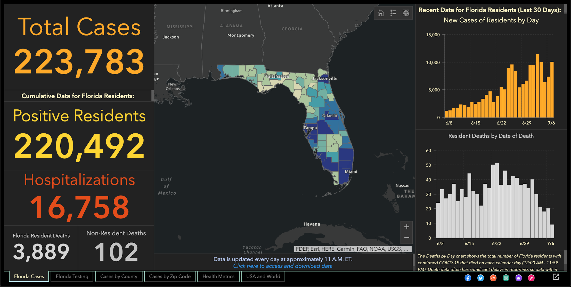
Since the beginning of the coronavirus pandemic, Florida has blocked, obscured, delayed, and at times hidden the COVID-19 data used in making big decisions such as reopening schools and businesses.
And with scientists warning Thanksgiving gatherings could cause an explosion of infections, the shortcomings in the state’s viral reporting have yet to be fixed.
While the state has put out an enormous amount of information, some of its actions have raised concerns among researchers that state officials are being less than transparent.
It started even before the pandemic became a daily concern for millions of residents. Nearly 175 patients tested positive for the disease in January and February, evidence the Florida Department of Health collected but never acknowledged or explained. The state fired its nationally praised chief data manager, she says in a whistleblower lawsuit, after she refused to manipulate data to support premature reopening. The state said she was fired for not following orders.
The health department used to publish coronavirus statistics twice a day before changing to once a day, consistently meeting an 11 a.m. daily deadline for releasing new information that scientists, the media and the public could use to follow the pandemic’s latest twists.
But in the past month the department has routinely and inexplicably failed to meet its own deadline by as much as six hours. On one day in October, it published no update at all.
News outlets were forced to sue the state before it would publish information identifying the number of infections and deaths at individual nursing homes.
Throughout it all, the state has kept up with the rapidly spreading virus by publishing daily updates of the numbers of cases, deaths and hospitalizations.
“Florida makes a lot of data available that is a lot of use in tracking the pandemic,” University of South Florida epidemiologist Jason Salemi said. “They’re one of the only states, if not the only state, that releases daily case line data (showing age, sex and county for each infected person).”
Dr. Terry Adirim, chairwoman of Florida Atlantic University’s Department of Integrated Biomedical Science, agreed, to a point.
“The good side is they do have daily spreadsheets,” Adirim said. “However, it’s the data that they want to put out.”
The state leaves out crucial information that could help the public better understand who the virus is hurting and where it is spreading, Adirim said.
The department, under state Surgeon General Dr. Scott Rivkees, oversees 53? health agencies covering Florida’s 67 counties, such as the one in Palm Beach County headed by Dr. Alina Alonso.
Rivkees was appointed in April 2019. He reports to Gov. Ron DeSantis, a Republican who has supported President Donald Trump’s approach to fighting the coronavirus and pressured local officials to reopen schools and businesses despite a series of spikes indicating rapid spread of the disease.
At several points, the DeSantis administration muzzled local health directors, such as when it told them not to advise school boards on reopening campuses.
The health department’s own coronavirus reports indicated that the pathogen had been infecting Floridians since January, yet health officials never informed the public about it and they did not publicly acknowledge it even after The Palm Beach Post first reported it in May.
In fact, the night before The Post broke the story, the department inexplicably removed from public view the state’s dataset that provided the evidence. Mixed among listings of thousands of cases was evidence that up to 171 people ages 4 to 91 had tested positive for COVID-19 in the months before officials announced in March the disease’s presence in the state.
Were the media reports on the meaning of those 171 cases in error? The state has never said.
When positive tests were finally acknowledged in March, all tests had to be confirmed by federal health officials. But Florida health officials refused to even acknowledge how many people in each county had been tested.
State health officials and DeSantis claimed they had to withhold the information to protect patient privacy, but they provided no evidence that stating the number of people tested would reveal personal information.
At the same time, the director of the Hillsborough County branch of the state health department publicly revealed that information to Hillsborough County commissioners.
And during March the state published on a website that wasn’t promoted to the public the ages and genders of those who had been confirmed to be carrying the disease, along with the counties where they claimed residence.
In May, with the media asking about data that revealed the earlier onset of the disease, internal emails show that a department manager ordered the state’s coronavirus data chief to yank the information off the web, even though it had been online for months.
A health department tech supervisor told data manager Rebekah Jones on May 5 to take down the dataset. Jones replied in an email that was the “wrong call,” but complied, only to be ordered an hour later to put it back.
That day, she emailed reporters and researchers following a listserv she created, saying she had been removed from handling coronavirus data because she refused to manipulate datasets to justify DeSantis’ push to begin reopening businesses and public places.
Two weeks later, the health department fired Jones, who in March had created and maintained Florida’s one-stop coronavirus dashboard, which had been viewed by millions of people, and had been praised nationally, including by White House Coronavirus Task Force Coordinator Deborah Birx.
The dashboard allows viewers to explore the total number of coronavirus cases, deaths, tests and other information statewide and by county and across age groups and genders.
DeSantis claimed on May 21 that Jones wanted to upload bad coronavirus data to the state’s website. To further attempt to discredit her, he brought up stalking charges made against her by an ex-lover, stemming from a blog post she wrote, that led to two misdemeanor charges.
Using her technical know-how, Jones launched a competing COVID-19 dashboard website, FloridaCOVIDAction.com in early June. After national media covered Jones’ firing and website launch, people donated more than $200,000 to her through GoFundMe to help pay her bills and maintain the website.
People view her site more than 1 million times a day, she said. The website features the same type of data the state’s dashboard displays, but also includes information not present on the state’s site such as a listing of testing sites and their contact information.
Jones also helped launch TheCOVIDMonitor.com to collect reports of infections in schools across the country.
Jones filed a whistleblower complaint against the state in July, accusing managers of retaliating against her for refusing to change the data to make the coronavirus situation look better.
“The Florida Department of Health needs a data auditor not affiliated with the governor’s office because they cannot be trusted,” Jones said Friday.
When coronavirus kills someone, their county’s medical examiner’s office logs their name, age, ethnicity and other information, and sends it to the Florida Department of Law Enforcement.
During March and April, the department refused requests to release that information to the public, even though medical examiners in Florida always have made it public under state law. Many county medical examiners, acknowledging the role that public information can play in combating a pandemic, released the information without dispute.
But it took legal pressure from news outlets, including The Post, before FDLE agreed to release the records it collected from local medical examiners.
When FDLE finally published the document on May 6, it blacked out or excluded crucial information such as each victim’s name or cause of death.
But FDLE’s attempt to obscure some of that information failed when, upon closer examination, the seemingly redacted details could in fact be read by common computer software.
Outlets such as Gannett, which owns The Post, and The New York Times, extracted the data invisible to the naked eye and reported in detail what the state redacted, such as the details on how each patient died.
It took a lawsuit against the state filed by the Miami Herald, joined by The Post and other news outlets, before the health department began publishing the names of long-term care facilities with the numbers of coronavirus cases and deaths.
The publication provided the only official source for family members to find out how many people had died of COVID-19 at the long-term care facility housing their loved ones.
While the state agreed to publish the information weekly, it has failed to publish several times and as of Nov. 24 had not updated the information since Nov. 6.
It took more pressure from Florida news outlets to pry from the state government the number of beds in each hospital being occupied by coronavirus patients, a key indicator of the disease’s spread, DeSantis said.
That was one issue where USF’s Salemi publicly criticized Florida.
“They were one of the last three states to release that information,” he said. “That to me is a problem because it is a key indicator.”
One metric DeSantis touted to justify his decision in May to begin reopening Florida’s economy was the so-called positivity rate, which is the share of tests reported each day with positive results.
But Florida’s daily figures contrasted sharply with calculations made by Johns Hopkins University, prompting a South Florida Sun-Sentinel examination that showed Florida’s methodology underestimated the positivity rate.
The state counts people who have tested positive only once, but counts every negative test a person receives until they test positive, so that there are many more negative tests for every positive one.
John Hopkins University, on the other hand, calculated Florida’s positivity rate by comparing the number of people testing positive with the total number of people who got tested for the first time.
By John Hopkins’ measure, between 10 and 11 percent of Florida’s tests in October came up positive, compared to the state’s reported rate of between 4 and 5 percent.
Health experts such as those at the World Health Organization have said a state’s positivity rate should stay below 5 percent for 14 days straight before it considers the virus under control and go forward with reopening public places and businesses. It’s also an important measure for travelers, who may be required to quarantine if they enter a state with a high positivity rate.
The Post reported in June that the share of tests taken by Black and Hispanic people and in majority minority ZIP codes were twice as likely to come back positive compared to tests conducted on white people and in majority white ZIP codes.
That was based on a Post analysis of internal state data the health department will not share with the public.
The state publishes bar charts showing general racial breakdowns but not for each infected person.
If it wanted to, Florida’s health department could publish detailed data that would shed light on the infection rates among each race and ethnicity or each age group, as well as which neighborhoods are seeing high rates of contagion.
Researchers have been trying to obtain this data but “the state won’t release the data without (making us) undergo an arduous data use agreement application process with no guarantee of release of the data,” Adirim said. Researchers must read and sign a 26-page, nearly 5,700-word agreement before getting a chance at seeing the raw data.
While Florida publishes the ages, genders and counties of residence for each infected person, “there’s no identification for race or ethnicity, no ZIP code or city of the residence of the patient,” Adirim said. “No line item count of negative test data so it’s hard to do your own calculation of test positivity.”
While Florida doesn’t explain its reasoning, one fear of releasing such information is the risk of identifying patients, particularly in tiny, non-diverse counties.
Florida’s daily report shows how many positive results come from each laboratory statewide. Except when it doesn’t.
The report has shown for months that 100 percent of COVID-19 tests conducted by some labs have come back positive despite those labs saying that shouldn’t be the case.
While the department reported in July that all 410 results from a Lee County lab were positive, a lab spokesman told The Post the lab had conducted roughly 30,000 tests. Other labs expressed the same confusion when informed of the state’s reporting.
The state health department said it would work with labs to fix the error. But even as recently as Tuesday, the state’s daily report showed positive result rates of 100 percent or just under it from some labs, comprising hundreds of tests.
As DeSantis pushed in August for reopening schools and universities for students to attend in-person classes, Florida’s health department published a report showing hundreds of infections could be traced back to schools, before pulling that report from public view.
The health department claimed it published that data by mistake, the Miami Herald reported.
The report showed that COVID-19 had infected nearly 900 students and staffers.
The state resumed school infection reporting in September.
A similar publication of cases at day-care centers appeared online briefly in August only to come down permanently.
After shifting in late April to updating the public just once a day at 11 a.m. instead of twice daily, the state met that deadline on most days until it started to falter in October. Pandemic followers could rely on the predictability.
On Oct. 10, the state published no data at all, not informing the public of a problem until 5 p.m.
The state blamed a private lab for the failure but the next day retracted its statement after the private lab disputed the state’s explanation. No further explanation has been offered.
On Oct. 21, the report came out six hours late.
Since Nov. 3, the 11 a.m. deadline has never been met. Now, late afternoon releases have become the norm.
“They have gotten more sloppy and they have really dragged their feet,” Adirim, the FAU scientist, said.
No spokesperson for the health department has answered questions from The Post to explain the lengthy delays. Alberto Moscoso, the spokesman throughout the pandemic, departed without explanation Nov. 6.
The state’s tardiness can trip up researchers trying to track the pandemic in Florida, Adirim said, because if one misses a late-day update, the department could overwrite it with another update the next morning, eliminating critical information and damaging scientists’ analysis.
As if to show disregard for concerns raised by scientists, the DeSantis administration brought in a new data analyst who bragged online that he is no expert and doesn’t need to be.
Kyle Lamb, an Uber driver and sports blogger, sees his lack of experience as a plus.
“Fact is, I’m not an ‘expert’,” Lamb wrote on a website for a subscribers-only podcast he hosts about the coronavirus. “I also don’t need to be. Experts don’t have all the answers, and we’ve learned that the hard way throughout the entire duration of the global pandemic.”
Much of his coronavirus writings can be found on Twitter, where he has said masks and mandatory quarantines don’t stop the virus’ spread, and that hydroxychloroquine, a drug touted by President Donald Trump but rejected by medical researchers, treats it successfully.
While DeSantis says lockdowns aren’t effective in stopping the spread and refuses to enact a statewide mask mandate, scientists point out that quarantines and masks are extremely effective.
The U.S. Food and Drug Administration has said hydroxychloroquine is unlikely to help and poses greater risk to patients than any potential benefits.
Coronavirus researchers have called Lamb’s views “laughable,” and fellow sports bloggers have said he tends to act like he knows much about a subject in which he knows little, the Miami Herald reported.
DeSantis has yet to explain how and why Lamb was hired, nor has his office released Lamb’s application for the $40,000-a-year job. “We generally do not comment on such entry level hirings,” DeSantis spokesman Fred Piccolo said Tuesday by email.
It could be worse.
Texas health department workers have to manually enter data they read from paper faxes into the state’s coronavirus tracking system, The Texas Tribune has reported. And unlike Florida, Texas doesn’t require local health officials to report viral data to the state in a uniform way that would make it easier and faster to process and report.
It could be better.
In Wisconsin, health officials report the number of cases and deaths down to the neighborhood level. They also plainly report racial and ethnic disparities, which show the disease hits Hispanic residents hardest.
Still, Salemi worries that Florida’s lack of answers can undermine residents’ faith.
“My whole thing is the communication, the transparency,” Salemi said. “Just let us know what’s going on. That can stop people from assuming the worst. Even if you make a big error people are a lot more forgiving, whereas if the only time you’re communicating is when bad things happen … people start to wonder.”

A group of health system leaders in Missouri challenged state-reported hospital bed data, saying it could lead to a misunderstanding about hospital capacity, according to a Nov. 19 report in the St. Louis Business Journal.
A consortium of health systems, including St. Louis-based BJC HealthCare, Mercy, SSM Health and St. Luke’s Hospital, released urgent reports warning that hospital and ICU beds are nearing capacity while state data reports show a much different story.
The state reports, based on data from TeleTracking and the CDC-managed National Healthcare Safety Network, show inpatient hospital bed capacity at 35 percent and remaining ICU bed capacity at 29 percent on Nov. 19. However, the consortium reported hospitals are fuller, at 84 percent capacity as of Nov. 18, and ICUs at 90 percent capacity based on staffed bed availability. The consortium says it is using staffed bed data while the state’s numbers are based on licensed bed counts; the state contends it does take staffing into account, according to the report.
Stephanie Zoller Mueller, a spokesperson for the consortium, said the discrepancy between the state’s data and consortium’s data could create a “gross misunderstanding on the part of some and can be a dangerous message to the community.”

Problems with the government’s rationale for authorizing use of convalescent plasma in COVID-19 patients go far beyond the dustup over the purported 35% survival benefit cited by top officials on Sunday, numerous researchers say.
That figure quickly came under fire, leading to an apology from Commissioner Stephen Hahn, MD — but that’s not the only criticism leveled at the FDA’s analysis of the available data.
Much of it came from the Mayo Clinic and FDA expanded access program (EAP), at this point published only as a preprint manuscript. Although a large number of patients were included, the study was observational only, with no untreated control group. That makes the findings merely hypothesis-generating, and can’t offer any firm conclusions.
That’s fine for issuing an emergency use authorization (EUA), but not so much for making claims about survival benefit, independent researchers said.
“It’s not even a question of overstating,” Adam Gaffney, MD, MPH, a critical care doctor and health policy researcher at Harvard Medical School, told MedPage Today. “You can’t state much at all when you don’t have a randomized controlled trial.”
“People have made a big deal of Hahn referring to relative versus absolute risk reduction, but I think that’s less of a big deal,” Gaffney said. “The biggest problem is that the data they are citing … is not randomized. That’s the source of all the problems.”
Hahn took heat for saying that a “35% improvement in survival is a pretty substantial clinical benefit” further explaining that of “100 people who are sick with COVID-19, 35 would have been saved because of the administration of plasma.”
Critics rapidly took to Twitter, stating that the interpretation was incorrect. Hahn was referring to relative risk reduction, not absolute risk reduction. Thus, calculating the number of lives saved — which isn’t something experts recommend doing based on observational data in the first place — would have translated to somewhere more in the ballpark of 5 out of 100.
Moreover, the “risk reduction” came from a comparison of patients treated with high-titer plasma versus those receiving lower-titer preparations. The study offered no basis for concluding how many patients may have been “saved” relative to standard care.
And the 35% reduction in that analysis was for 7-day mortality; the relative reduction at 30 days was only 23%.
Hahn’s recital of the 35% figure “was just PART of the error,” tweeted Vinay Prasad, MD, MPH, of the University of California San Francisco. “The entire comparison is flawed. It is not a suitable control. The data don’t show anything useful.”
“The much broader problem here is the lack of commitment to performing large, national randomized controlled trials,” Gaffney said. “We could have done it for convalescent plasma. Instead, we did the EAP. I understand why people wanted it, but now we don’t know [if convalescent plasma works]. We have a question mark instead of a period.”
Undermining Trust in FDA?
Critics have charged that serious mistakes like Hahn’s misstatement could undermine FDA’s credibility, especially as it faces challenging decisions about potentially approving a vaccine this fall.
“This is playing out in the context of a hyper-politicized moment,” Gaffney said. “It behooves everyone to be extremely cautious in speaking about these things to avoid the appearance of politicization.”
On CBS This Morning on Tuesday, Hahn addressed concerns about politicization by offering reassurance to the “American people that this decision was made based upon sound science and data.”
In response to questions about the timing of the EUA announcement — it came just a day after President Donald Trump tweeted allegations that the “deep state” was holding back access to COVID-19 treatments with Hahn’s Twitter handle cited, and a day before the Republican National Convention got underway — Hahn said the agency had been working on the application for 3 or 4 weeks and was waiting on additional validation data, which were received at the end of last week and over the weekend.
“We’re going to continue to get data and as we’ve done with any other authorization, we will update that decision as new data come,” Hahn said on the news program. His agency initially issued an EUA for hydroxychloroquine, for instance, but later revoked it when the negative randomized trial data became available.
Lack of Access to FDA’s Data Review
Whether the public will ever see the full convalescent plasma data underlying the EUA is another matter. The “Clinical Memorandum” issued as the evidence behind the FDA’s decision glossed over the statistical analysis conducted by the agency; in particular, it made no mention of the 35% relative reduction in deaths.
Another problem with that is the 35% figure’s source isn’t fully clear. Although the EAP preprint manuscript is the most obvious source, Gaffney noted that HHS Secretary Alex Azar said it referred to a subgroup of patients under age 80 who were not on a ventilator. That is not found in the publicly available data. He also pointed to a tweet by FDA spokesperson Emily Miller that contains an agency slide showing a 37% reduction in mortality for non-intubated patients age 80 or under treated within 72 hours who got high-titer convalescent plasma, compared with low-titer product. Neither of those figures is reflected in the EAP manuscript.
The FDA did not return a request by MedPage Today for the full summary of data reviewed by FDA and any independent statistical analysis done by the agency.
Shmuel Shoham, MD, of Johns Hopkins University in Baltimore, said during a press briefing organized by the Infectious Diseases Society of America that “enormous amounts of data have been generated” from the EAP, in which more than 70,000 patients have been treated.
“Some data have been reported in articles and at meetings, but that’s only part of what the FDA — this is their program — has access to,” he said. “The stuff in the public domain is only a fraction of the data they have collected.”
Shoham is on the scientific advisory board of the EAP and is involved in two convalescent plasma clinical trials at Johns Hopkins.
Gaffney said Mayo researchers and FDA reviewers have noted that physicians were blinded to the dose of antibody given in plasma infusions, which he described as a “pseudo-randomization effect. We could use that to make more causal inferences about the effectiveness of antibody titers.”
However, he said there were some significant differences between those who received high-titer versus low-titer antibody, including differences in P-to-F ratio (a measure of inhaled oxygen to blood oxygen) and in those with five or more severe risk factors, suggesting the low-titer group was sicker to begin with than the high-titer group.
Also, patients in the EAP received a variety of other treatments: about half got steroids and 40% were given remdesivir.
“This is why we do randomized controlled trials,” Gaffney said. “Without them it’s very difficult to ensure that the effect you see is the result of the drug, and not the result of patient characteristics.”
Is an Answer Forthcoming?
Several randomized controlled trials of convalescent plasma are underway in the U.S., but the big concern is that wider access to convalescent plasma will limit enrollment. Will clinicians recommend that their patients enroll in a trial in which they might receive placebo? Will patients agree?
For the Hopkins studies, the prevention trial has enrolled 25 people out of a goal of 500, and its outpatient trial has enrolled 50 people of its 600-patient goal.
Liise-anne Pirofski, MD, of Montefiore Medical Center in New York, started a study at the end of April, looking to enroll 300 people. She said the team enrolled the first 150 people quickly, but “then the pandemic began to wane in New York.” With subsequent funding from the NIH, the trial has managed to enroll 190 patients, and has now expanded to four additional sites: New York University, Yale, the University of Miami, and the University of Texas Houston.
Clifton Callaway, MD, PhD, of the University of Pittsburgh Medical Center and lead investigator on the C3PO trial looking at outpatient convalescent plasma, said he hopes the EUA doesn’t discourage participation.
“To the contrary, I believe it should reassure persons considering participation that the FDA feels that convalescent plasma is safe and potentially useful and that the FDA specifically comments: ‘Current data suggest the largest clinical benefit is associated with high-titer units of CCP administered early in the course of disease.’ Giving high-titer convalescent plasma earlier (before you are sick enough to be in the hospital) is exactly what C3PO is testing.”
In addition to determining whether earlier or prophylactic treatment works, Shoham said other unanswered questions include identifying whether other components in plasma are useful therapies and whether low-titer plasma can work at all.
“What everyone agrees on is that the gaps in knowledge that exist can best be addressed by high-quality randomized controlled trials,” he said.
Pirofski said the science and data should be the focus, “rather than the decision and what drove the decision…. I don’t think anyone knows what drove that decision other than the people in that room. Hopefully they know.”

The order to reroute CDC hospitalization figures raised accuracy concerns. But that’s just one of the problems with how the country collects health data.
TWO WEEKS AGO, the Department of Health and Human Services stripped the Centers for Disease Control and Prevention of control of national data on Covid-19 infections in hospitalized patients. Instead of sending the data to the CDC’s public National Healthcare Safety Network (NHSN), the department ordered hospitals to send it to a new data system, run for the agency by a little-known firm in Tennessee.
The change took effect immediately. First, the hospitalization data collected up until July 13 vanished from the CDC’s site. One day later, it was republished—but topped by a note that the NHSN Covid-19 dashboard would no longer be updated.
Fury over the move was immediate. All the major organizations that represent US public health professionals objected vociferously. A quickly written protest letter addressed to Vice President Mike Pence, HHS secretary Alex Azar, and Deborah Birx, the coordinator of the White House’s Coronavirus Task Force, garnered signatures from more than 100 health associations and research groups. The reactions made visible the groups’ concerns that data could be lost or duplicated, and underlined their continual worry that the CDC is being undercut and sidelined. But it had no other effect. The new HHS portal, called HHS Protect, is up and running.
Behind the crisis lies a difficult reality: Covid-19 data in the US—in fact, almost all public health data—is chaotic: not one pipe, but a tangle. If the nation had a single, seamless system for collecting, storing, and analyzing health data, HHS and the Coronavirus Task Force would have had a much harder time prying the CDC’s Covid-19 data loose. Not having a comprehensive system made the HHS move possible, and however well or badly the department handles the data it will now receive, the lack of a comprehensive data system is harming the US coronavirus response.
“Every health system, every public health department, every jurisdiction really has their own ways of going about things,” says Caitlin Rivers, a senior scholar at the Johns Hopkins Center for Health Security. “It’s very difficult to get an accurate and timely and geographically resolved picture of what’s happening in the US, because there’s such a jumble of data.”
Data systems are wonky objects, so it may help to step back and explain a little history. First, there’s a reason why hospitalization data is important: Knowing whether the demand for beds is rising or falling can help illuminate how hard-hit any area is, and whether reopening in that region is safe.
Second, what the NHSN does is important too. It’s a 15-year-old database, organized in 2005 out of several streams of information that were already flowing to the CDC, which receives data from hospitals and other health care facilities about anything that affects the occurrence of infections once someone is admitted. That includes rates of pneumonia from use of ventilators, infections after surgery, and urinary tract infections from catheters, for instance—but also statistics about usage of antibiotics, adherence to hand hygiene, complications from dialysis, occurrence of the ravaging intestinal infection C. difficile, and rates of health care workers getting flu shots. Broadly, it assembles a portrait of the safety of hospitals, nursing homes, and chronic care institutions in the US, and it shares that data with researchers and with other statistical dashboards published by other HHS agencies such as the Center for Medicare and Medicaid Services.
Because NHSN only collects institutional data, and Covid-19 infections occur both inside institutions such as nursing homes and hospitals, and in the outside world, HHS officials claimed the database was a bad fit for the coronavirus pandemic. But people who have worked with it argue that since the network had already devised channels for receiving all that data from health care systems, it ought to continue to do so—especially since that data isn’t easy to abstract.
“If you are lucky enough to work in a large health care system that has a sophisticated electronic medical record, then possibly you can push one button and have all the data flow up to NHSN,” says Angela Vassallo, an epidemiologist who formerly worked at HHS and is now chief clinical adviser to the infection-prevention firm Covid Smart. “But that’s a rare experience. Most hospitals have an infection preventionist, usually an entire team, responsible for transferring that data by hand.”
There lies the core problem. Despite big efforts back during the Obama administration to funnel all US health care data into one large-bore pipeline, what exists now resembles what you’d find behind the walls of an old house: pipes going everywhere, patched at improbable angles, some of them leaky, and some of them dead ends. To take some examples from the coronavirus response: Covid-19 hospital admissions were measured by the NHSN (before HHS intervened), but cases coming to emergency departments were reported in a different database, and test results were reported first to local or state health departments, and then sent up to the CDC.
Covid-19 data in particular has been so messy that volunteer efforts have sprung up to fix it. These include the COVID Tracking Project—compiled from multiple sources and currently the most comprehensive set of statistics, used by media organizations and apparently by the White House—and Covid Exit Strategy, which uses data from the COVID Tracking Project and the CDC.
Last week, the American Public Health Association, the Johns Hopkins Center, and Resolve to Save Lives, a nonprofit led by former CDC director Tom Frieden, released a comprehensive report on Covid-19 data collection. Pulling no punches, they called the current situation an “information catastrophe.”
The US, they found, does not have national-, state-, county-, or city-level standards for Covid-19 data. Every state maintains some form of coronavirus dashboard (and some have several), but every dashboard is different; no two states present the same data categories, nor visualize them the same way. The data presented by states is “inconsistent, incomplete, and inaccessible,” the group found: Out of 15 key pieces of data that each state should be presenting—things such as new confirmed and probable cases, new tests performed, and percentage of tests that are positive—only 38 percent of the indicators are reported in some way, with limitations, and 60 percent are not reported at all.
“This is not the fault of the states—there was no federal leadership,” Frieden emphasized in an interview with WIRED. “And this is legitimately difficult. But it’s not impossible. It just requires commitment.”
But the problem of incomplete, messy data is older and deeper than this pandemic. Four scholars from the health-policy think tank the Commonwealth Fund called out the broader problem just last week in an essay in The New England Journal of Medicine, naming health data as one of four interlocking health care crises exposed by Covid-19. (The others were reliance on employer-provided health care, financial losses in rural and primary-care practices, and the effect of the pandemic on racial and ethinic minorities.)
“There is no national public health information system—electronic or otherwise—that enables authorities to identify regional variation in the demand for, and supply of, resources critical to managing Covid-19,” they wrote. The fix they recommended: a national public health information system that would record diagnoses in real time, monitor the materials hospitals need, and link hospitals and outpatient care, state and local health departments, and laboratories and manufacturers to maintain real-time reporting on disease occurrence, preventive measures, and equipment production.
They are not the first to say this is needed. In February, 2019, the Council of State and Territorial Epidemiologists launched a campaign to get Congress to appropriate $1 billion in new federal funding over 10 years specifically to improve data flows. “The nation’s public health data systems are antiquated, rely on obsolete surveillance methods, and are in dire need of security upgrades,” the group wrote in its launch statement. “Sluggish, manual processes—paper records, spreadsheets, faxes, and phone calls—still in widespread use, have consequences, most notably delayed detection and response to public health threats.”
Defenders of the HHS decision to switch data away from the CDC say that improving problems like that is what the department was aiming for. (“The CDC’s old hospital data-gathering operation once worked well monitoring hospital information across the country, but it’s an inadequate system today,” HHS assistant secretary for public affairs Michael Caputo told CNN.) If that’s an accurate claim, during a global pandemic is a challenging time to do it.
“We were opposed to this, because trying to do this in the middle of a disaster is not the time,” says Georges Benjamin, a physician and executive director of the American Public Health Association, which was a signatory to the letter protesting moving data from the NHSN. “It was just clearly done without a lot of foresight. I don’t think they understand the way data moves into and through the system.”
The past week has shown how correct that concern was. Immediately after the switch, according to CNBC, states were blacked out from receiving data on their own hospitals, because the hospitals were not able to manage the changeover from the CDC to the HHS system. On Tuesday, Ryan Panchadsaram, cofounder of Covid Exit Strategy and former deputy chief technology officer for the US, highlighted on Twitter that data on the HHS dashboard, advertised as updating daily, was five days old. And Tuesday night, the COVID Tracking Project staff warned in a long analysis: “Hospitalization data from states that was highly stable a few weeks ago is currently fragmented, and appears to be a significant undercount.”
When the Covid-19 crisis is over, as everyone hopes it will be someday, the US will still have to wrestle with the questions it raised. One of those will be how the richest country on the planet, with some of the best clinical care in the world, was content with a health information system that left it so uninformed about a disease affecting so many of its citizens. The answer could involve tearing the public-health data system down and building it again from scratch.
“This is a deeply entrenched problem, where there is no single person who has not done their job,” Rivers says. “Our systems are old. They were not updated. We haven’t invested in them. If you’re trying to imagine a system where everyone reports the same information in the same way and we can push a button and have all the information we might want, that will take a complete overhaul of what we have.”

